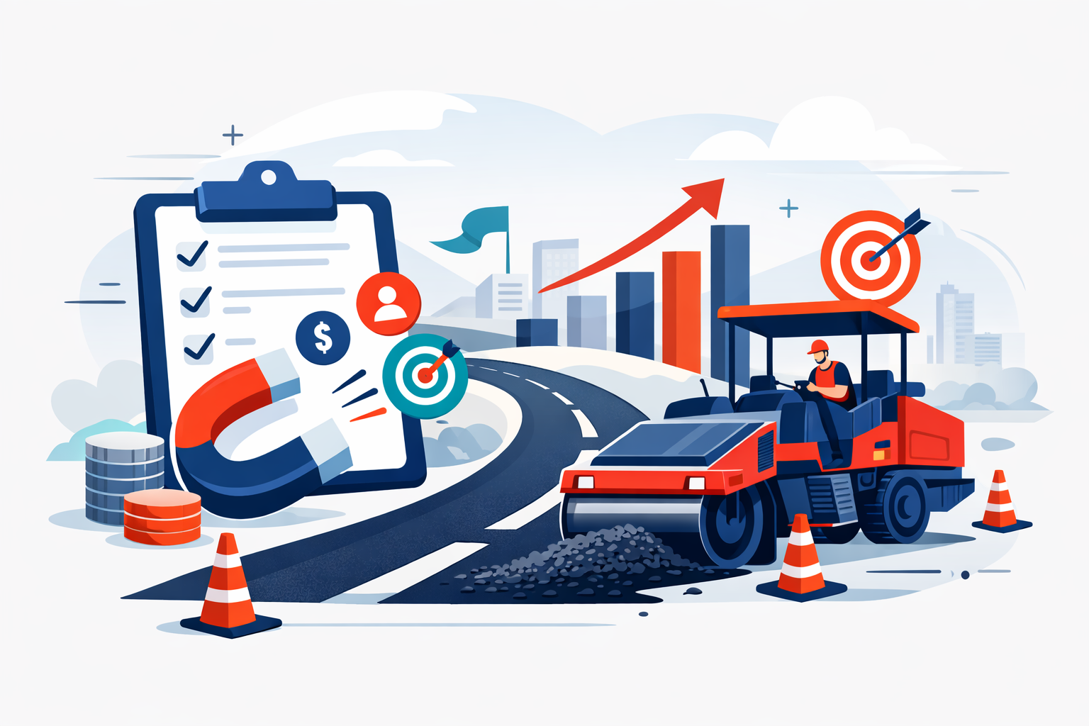
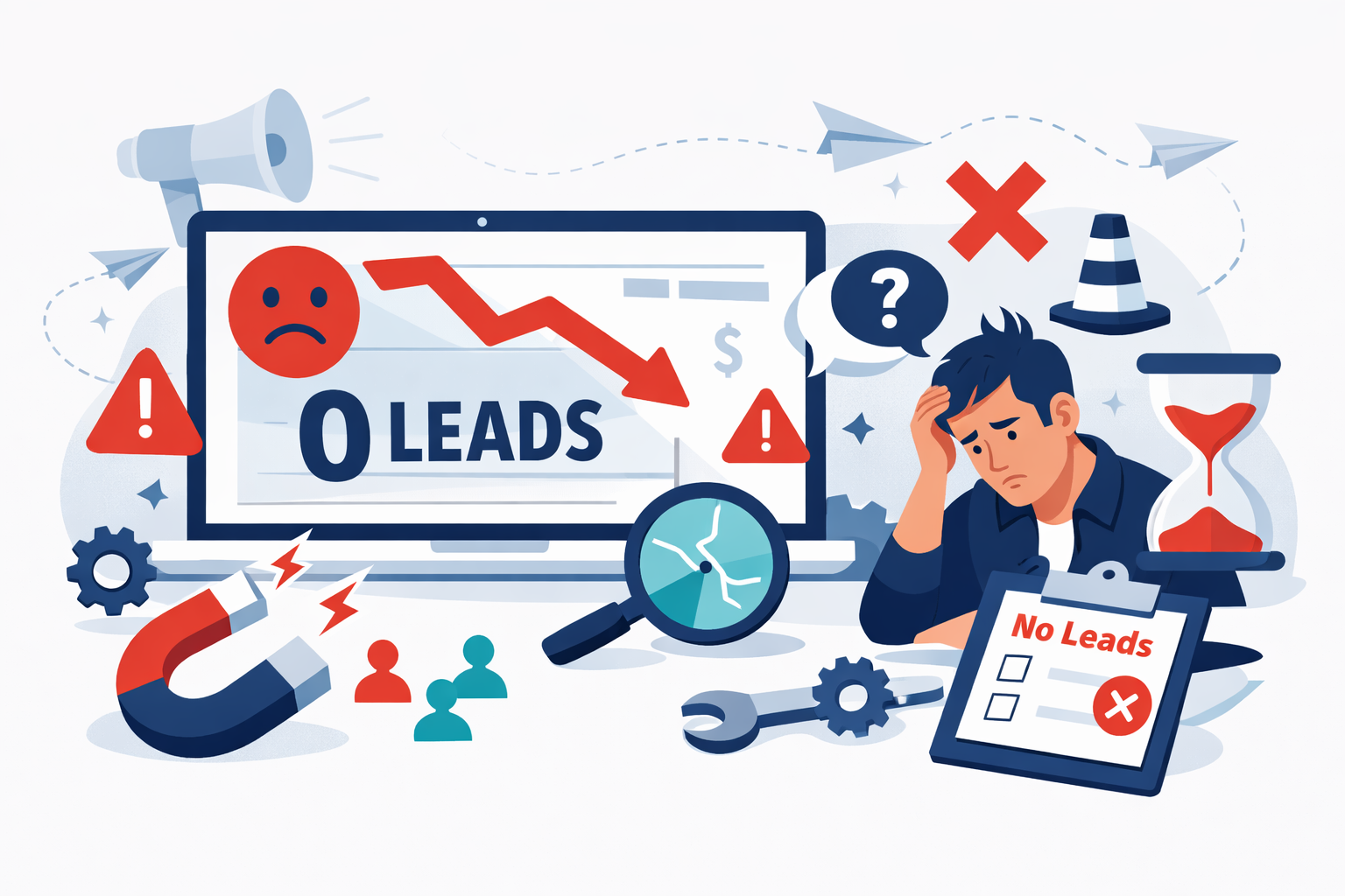
You’ve done everything right. You invested in a professional website, hired someone to handle SEO, maybe even ran some paid ads. Traffic is coming in. Google Analytics shows visitors landing on your pages every day. But here’s the problem: your phone isn’t ringing, your inbox stays empty, and those contact forms collect dust.
This disconnect between traffic and leads is one of the most frustrating problems business owners face. I’ve watched companies pour thousands into driving visitors to websites that function more like digital brochures than lead generation machines. The traffic numbers look impressive in reports, but the sales team has nothing to work with.
The good news? When your website isn’t generating leads, the fixes are usually identifiable and actionable. The issue rarely comes down to one catastrophic failure. Instead, it’s typically a combination of friction points, messaging problems, and conversion obstacles that compound to kill your results. Understanding why your website isn’t converting visitors into leads requires examining several interconnected elements: user experience, value proposition clarity, call-to-action effectiveness, and form design.
Over the years, I’ve helped dozens of B2B companies diagnose and repair broken lead generation systems. The patterns repeat themselves with remarkable consistency. What follows is a systematic breakdown of where websites fail and exactly how to fix each problem.
Contents
- 1 Diagnosing the Gap Between Traffic and Conversions
- 2 Optimizing User Experience for Frictionless Navigation
- 3 Refining Your Value Proposition and Messaging
- 4 Fixing Weak or Non-Existent Calls to Action
- 5 Optimizing Lead Capture Forms for Higher Completion
- 6 Leveraging Lead Magnets and Content Upgrades
- 7 Implementing a Continuous Testing and Improvement Framework
Diagnosing the Gap Between Traffic and Conversions
Before fixing anything, you need to understand what’s actually happening on your site. Raw traffic numbers tell you almost nothing about lead generation effectiveness. A site getting 10,000 monthly visitors with a 0.5% conversion rate generates 50 leads. A site with 2,000 visitors converting at 5% produces 100 leads. Traffic volume matters far less than what happens after someone arrives.
Analyzing High Bounce Rates and User Behavior
Bounce rate tells you the percentage of visitors who leave without taking any action. For most B2B sites, a bounce rate above 60% signals trouble. But the number alone doesn’t tell the whole story.
Install heatmapping software like Hotjar or Crazy Egg to see exactly where visitors click, how far they scroll, and where they abandon pages. I’ve seen companies discover that 70% of their visitors never scroll past the first screen, meaning everything below the fold might as well not exist. Session recordings reveal the actual user experience: visitors clicking on elements that aren’t links, getting confused by navigation, or abandoning pages after encountering unexpected friction.
Look for patterns in your data. Are visitors from certain traffic sources bouncing at higher rates? Do mobile users behave differently than desktop users? These insights point directly to specific problems worth fixing.
Identifying Misalignment Between Traffic Sources and Content
Sometimes the traffic itself is the problem. If you’re ranking for keywords that attract researchers rather than buyers, or running ads that promise something your landing page doesn’t deliver, you’ll see high traffic and low conversions.
Examine your top landing pages alongside the search queries or ad copy driving traffic to them. A manufacturing company I worked with ranked well for “how does injection molding work” but struggled to convert that traffic because visitors wanted educational content, not a sales pitch. The fix wasn’t changing the page: it was creating a content upgrade that captured emails in exchange for a detailed technical guide.
Match your content to visitor intent. Informational queries need informational content with soft conversion opportunities. Commercial queries need pages that address buying concerns and offer clear next steps.
Your website’s user experience directly impacts whether visitors stay long enough to convert. Every second of confusion or frustration pushes potential leads closer to the back button.
Improving Page Load Speed and Mobile Responsiveness
Page speed affects both rankings and conversions. Google’s research shows that as page load time increases from one second to three seconds, bounce probability increases by 32%. At five seconds, that probability jumps to 90%.
Test your site speed using Google PageSpeed Insights and GTmetrix. Focus on the metrics that matter most: Largest Contentful Paint should be under 2.5 seconds, and First Input Delay should stay below 100 milliseconds. Common fixes include compressing images, enabling browser caching, minimizing JavaScript, and upgrading hosting. A B2B software company I consulted for reduced their main landing page load time from 4.2 seconds to 1.8 seconds and saw form submissions increase by 23% within 30 days.
Mobile responsiveness isn’t optional anymore. Over 60% of B2B research happens on mobile devices. If your forms are tiny, your buttons are hard to tap, or your content requires pinching and zooming, you’re losing leads.
Simplifying Site Structure to Guide the Buyer Journey
Visitors should never have to think about where to go next. Your navigation should reflect how buyers actually think, not your internal organizational structure.
Limit main navigation to five or six options maximum. Use clear, benefit-oriented labels rather than clever or branded terms. “Solutions” tells visitors nothing; “Services for Manufacturers” tells them exactly whether they’re in the right place.
Create clear pathways from awareness to consideration to decision. Every page should have an obvious next step. If someone reads a blog post about a problem, the next logical step might be a case study showing how you solved that problem. From the case study, they should easily find a way to request a consultation.
Refining Your Value Proposition and Messaging
Most websites fail to answer the visitor’s fundamental question: “Why should I care?” Generic messaging that could apply to any competitor gives visitors no reason to choose you.
Crafting Headlines That Address Customer Pain Points
Your headline has roughly five seconds to convince visitors to keep reading. Headlines that focus on features or company history waste that precious window.
Effective headlines speak directly to the problem your ideal customer is trying to solve. Compare “Leading Provider of Enterprise Software Solutions” with “Stop Losing $50K Monthly to Manual Data Entry Errors.” The first says nothing meaningful. The second identifies a specific pain point and quantifies the cost of inaction.
Test different headline approaches. Problem-focused headlines often outperform benefit-focused ones because they trigger loss aversion. A headline like “Why 73% of RFPs Never Close” creates curiosity and urgency that “Win More RFPs” simply doesn’t match.
Building Trust Through Social Proof and Authority Signals
B2B buyers are risk-averse. They need evidence that choosing you won’t damage their career or waste their budget. Social proof reduces perceived risk and accelerates decision-making.
Display client logos prominently, but be strategic. Five recognizable logos beat twenty unknown ones. Include specific testimonials with full names, titles, and companies: “Great service!” from “John D.” carries zero credibility. Case studies with measurable results provide the strongest proof. “Increased qualified leads by 147% in six months” gives prospects a concrete expectation.
Industry certifications, awards, and media mentions add authority. If you’ve been featured in relevant publications or hold meaningful certifications, display them. These signals help visitors justify their decision to engage with you.
Fixing Weak or Non-Existent Calls to Action
I’ve audited websites where finding the contact information required scrolling through multiple pages. If visitors can’t immediately see how to take the next step, they won’t take it.
Using Persuasive Language Over Generic Buttons
“Submit” is the worst CTA button text in existence. It tells visitors nothing about what happens next and creates anxiety about what they’re committing to. “Contact Us” isn’t much better: it’s vague and implies effort without promising value.
Effective CTAs communicate the benefit of clicking. “Get Your Free Assessment” outperforms “Submit” because it tells visitors exactly what they’ll receive. “See Pricing” works better than “Learn More” when visitors are in buying mode because it promises specific, valuable information.
Match CTA language to the visitor’s stage. Early-stage visitors respond to lower-commitment offers: “Download the Guide” or “Watch the Demo.” Late-stage visitors ready to buy respond to direct language: “Start Your Free Trial” or “Schedule a Call.”
Strategic Placement and Visual Hierarchy of CTAs
CTAs need to appear where visitors are ready to act. That means above the fold on landing pages, at the end of compelling content sections, and in a sticky header or footer that follows scrolling.
Visual hierarchy matters. Your primary CTA should be the most visually prominent element on the page. Use contrasting colors that stand out from your site’s palette. Make buttons large enough to tap easily on mobile. Surround CTAs with white space so they don’t get lost in surrounding content.
Don’t hide your phone number or make visitors hunt for contact options. If phone calls are valuable to your business, that number should be visible on every page without scrolling.
Optimizing Lead Capture Forms for Higher Completion
Forms are where potential leads become actual leads: or abandon your site entirely. Every unnecessary field reduces completion rates.
Reducing Field Friction and Unnecessary Questions
The relationship between form length and conversion rate is well-documented. Reducing form fields from eleven to four can increase conversions by 120%. But the optimal length depends on your goals. Shorter forms generate more leads; longer forms generate more qualified leads.
Ask yourself which fields are truly necessary at the initial capture stage. You need enough information to follow up effectively, but you can gather additional details later. Name, email, and company are usually sufficient for top-of-funnel offers. Phone number and detailed questions can wait for sales-qualified stages.
Remove any field that makes visitors pause. “How did you hear about us?” can be tracked through analytics. “Budget” scares away early-stage prospects. “Company size” can be researched after capture using tools like Clearbit, which starts around $99 per month for basic enrichment.
Implementing Multi-Step Forms for Complex Offers
When you genuinely need detailed information, multi-step forms outperform single long forms. Breaking a ten-field form into three steps of three to four fields each feels less overwhelming and leverages commitment psychology: once someone completes step one, they’re more likely to finish.
Start with the easiest questions. Name and email require almost no thought. Save qualifying questions for later steps when visitors are already invested. Show progress indicators so visitors know how close they are to completion.
For high-value offers like consultations or demos, progressive profiling works well. Capture basic information initially, then use subsequent interactions to gather additional details. Your CRM or marketing automation platform, whether HubSpot at $800 per month for professional tier or similar tools, can track what you already know about each contact.
Leveraging Lead Magnets and Content Upgrades
Sometimes visitors aren’t ready to talk to sales but would exchange their contact information for something valuable. Lead magnets bridge the gap between anonymous visitor and known lead.
Effective lead magnets solve a specific problem your ideal customer faces. Generic “industry reports” rarely perform as well as targeted tools. A calculator that helps prospects estimate their potential savings, a checklist that guides them through a complex process, or a template they can immediately use: these provide tangible value that justifies sharing contact information.
Content upgrades work particularly well for blog traffic. If someone reads your article about reducing manufacturing defects, offer a downloadable quality control checklist at the end. The content upgrade should directly extend the value of what they just consumed. I’ve seen content upgrades convert at 25-30% compared to 1-3% for generic sidebar opt-ins.
Implementing a Continuous Testing and Improvement Framework
Fixing your website’s lead generation isn’t a one-time project. Markets change, competitors adapt, and what worked last year may underperform today. Building a testing culture ensures continuous improvement.
Start with your highest-impact pages: typically your homepage, main service pages, and top landing pages. These see the most traffic, so improvements compound quickly. Run A/B tests on headlines, CTAs, form lengths, and page layouts using tools like Unbounce at $99 per month or VWO starting around $199 per month.
Test one variable at a time and let tests run until you reach statistical significance, usually requiring at least 100 conversions per variation. Document everything: what you tested, the hypothesis, the result, and what you learned. Over time, this documentation becomes invaluable for understanding what resonates with your specific audience.
Review your conversion data monthly. Track not just form submissions but lead quality and downstream metrics. A change that increases form fills by 50% but decreases lead quality by 60% isn’t a win. Align marketing volume with your sales team’s capacity to follow up effectively.
The companies that consistently generate leads from their websites treat conversion optimization as an ongoing discipline rather than a completed task. They test continuously, learn from data, and iterate based on results rather than assumptions.
If building this capability in-house feels overwhelming, working with specialists can accelerate results. Abstrakt Marketing Group focuses specifically on B2B lead generation and has helped companies across the US and Canada build systems that consistently produce qualified opportunities. Learn how they can help if you’re ready to stop leaving leads on the table.

With more than a decade of progressive leadership in sales development, Alyssa Stevenson currently serves as Executive Vice President of Inbound SDR. She is a strategic growth driver, specializing in building and scaling high-performing inbound marketing teams that deliver measurable results.
Alyssa has a track record of transforming developing individuals to use Outbound and Inbound marketing to exceed business goals. Her leadership philosophy hinges on operational excellence, data-driven decision-making, and fostering a culture of continuous improvement.