
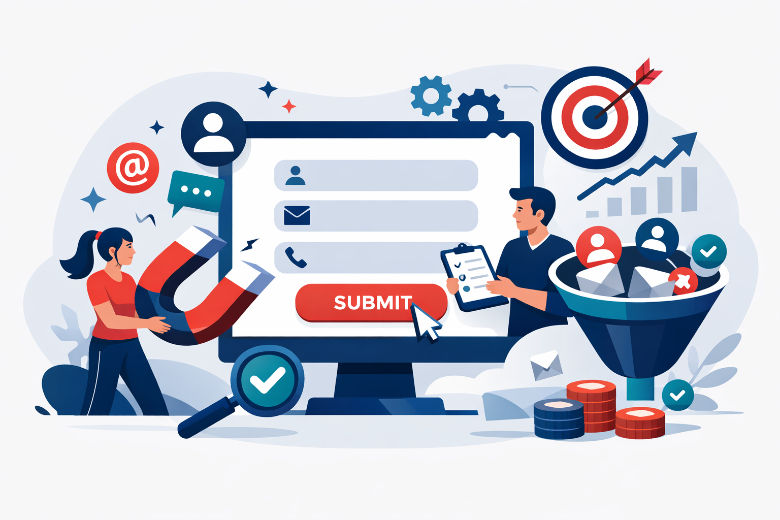
Your website gets traffic. People visit, browse, maybe even linger on a few pages. Then they leave, and you never hear from them again. Sound familiar? The gap between website traffic and actual business opportunities is where most companies hemorrhage potential revenue. I’ve watched businesses pour thousands into driving visitors to their sites while their lead capture systems leak like sieves.
Here’s the uncomfortable truth: getting traffic is the easy part. Converting anonymous visitors into identifiable leads requires intentional design, smart psychology, and continuous refinement. After helping dozens of B2B companies overhaul their conversion systems, I can tell you that most websites leave 80-90% of potential leads on the table through avoidable mistakes.
The good news? Improving lead capture on your website doesn’t require a complete redesign or massive budget. Small, strategic changes often produce dramatic results. I’ve seen companies double their monthly lead volume by adjusting form placement, tweaking copy, or simply asking for less information upfront. The principles are straightforward once you understand what actually drives visitor behavior.
What follows is everything I’ve learned about turning passive browsers into active leads: where to place your forms, how to reduce friction, what incentives actually work, and how to measure whether your changes are helping or hurting. These aren’t theoretical best practices pulled from marketing textbooks. They’re battle-tested tactics that work across industries, company sizes, and buyer types.
Contents
Strategic Placement of High-Converting Forms
Form placement isn’t about following rules. It’s about understanding how your specific visitors navigate your site and intercepting them at moments of peak interest. The same form can convert at 2% or 12% depending entirely on where and when it appears.
Leveraging Above-the-Fold Real Estate
The space visitors see before scrolling remains your most valuable conversion territory. Research consistently shows that 57% of viewing time is spent above the fold, with attention dropping sharply as visitors scroll. But here’s the nuance most marketers miss: above-the-fold placement works best when the value proposition is immediately clear.
I’ve tested this extensively. A form sitting at the top of a generic homepage with vague messaging converts poorly because visitors don’t yet understand what they’re getting. That same form on a landing page with a specific headline and clear benefit statement can convert at three to five times the rate. The position matters, but context matters more.
For service pages and product pages, consider placing a compact form in the right sidebar or as a floating element that stays visible during scrolling. This keeps the conversion opportunity present without interrupting the content consumption that builds buying intent.
Utilizing Sticky Bars and Exit-Intent Popups
Sticky bars: those thin notification-style banners at the top or bottom of the screen: work because they’re persistent without being aggressive. A well-designed sticky bar with a compelling offer typically adds 1-3% to overall conversion rates with minimal visitor annoyance. Tools like OptinMonster or ConvertFlow make implementation straightforward, usually running $50-150 monthly depending on traffic volume.
Exit-intent popups deserve their own consideration. When someone’s cursor moves toward the browser’s close button, triggering a targeted offer can recover 10-15% of abandoning visitors. The key is relevance. A generic “Subscribe to our newsletter” popup performs poorly. A specific offer tied to the page content: “Download our pricing comparison guide before you go”: converts significantly better.
I recommend limiting exit-intent popups to high-value pages like pricing, product comparisons, or case studies. Triggering them on every page creates visitor fatigue and damages brand perception.
Embedding Inline Forms within Content
Inline forms placed within blog posts and long-form content capture visitors at their moment of highest engagement. When someone has read 60% of an article, they’ve demonstrated genuine interest. An inline form offering related, deeper content converts these engaged readers at rates two to three times higher than sidebar forms.
The placement sweet spot is typically after the second or third major section, where you’ve delivered enough value to establish credibility but before the natural drop-off point. Test different positions using scroll-depth analytics to find where your specific audience engages most deeply.
Reducing Friction in the User Experience
Every additional field, every extra click, every moment of confusion costs you leads. Friction reduction isn’t about making forms shorter: it’s about making the entire conversion experience feel effortless.
Simplifying Form Fields for Higher Completion
The data is unambiguous here. Reducing form fields from four to three increases conversions by an average of 50%. Going from six fields to three can double or triple completion rates. I’ve seen B2B companies stubbornly require company size, industry, phone number, and job title on initial capture forms, then wonder why their conversion rates hover below 1%.
Ask yourself: what information do you actually need at this stage? For most initial lead captures, email and first name are sufficient. Everything else can come later through progressive profiling or sales conversations. Your marketing automation platform can append company data through tools like Clearbit or ZoomInfo, typically costing $100-500 monthly depending on volume.
The exception is when you need qualification data to route leads properly. If enterprise leads go to one team and SMB leads go to another, asking about company size makes sense. But be ruthless about cutting anything that doesn’t serve an immediate, concrete purpose.
Implementing Smart Fields and Auto-Fill
Smart forms remember returning visitors and skip fields they’ve already completed. HubSpot, Marketo, and Pardot all offer this functionality natively. For a returning lead, you might ask a single new question rather than making them re-enter their email and name. This progressive profiling approach builds complete lead profiles over time without front-loading friction.
Browser auto-fill compatibility matters more than most marketers realize. Forms that work seamlessly with Chrome and Safari auto-fill see 25-30% higher completion rates. Test your forms on multiple browsers and devices to ensure auto-fill triggers properly.
Optimizing Mobile Responsiveness
Mobile traffic now exceeds 50% for most B2B websites, yet I routinely see forms that are nearly impossible to complete on a phone. Tiny tap targets, keyboards that don’t match input types, and forms that require horizontal scrolling are conversion killers.
Mobile forms need larger input fields, appropriate keyboard types for each field, and single-column layouts. If your desktop form has fields side by side, they should stack vertically on mobile. Test every form on actual devices: not just browser emulators: to catch issues that only appear in real mobile contexts.
Crafting Compelling Lead Magnets
People don’t give you their email address because you asked nicely. They exchange their contact information for something they perceive as valuable. Your lead magnet’s perceived value directly determines your conversion rate.
Aligning Incentives with Audience Pain Points
Generic content doesn’t convert. A “Complete Guide to Marketing” appeals to no one in particular and therefore motivates no one to act. A “B2B SaaS Pricing Strategy Playbook: How 47 Companies Structure Their Tiers” speaks directly to a specific audience wrestling with a specific challenge.
The best lead magnets solve immediate, pressing problems. What questions do your sales team hear repeatedly? What objections come up in every demo? What decisions are your prospects struggling to make? Turn those answers into lead magnets, and conversion rates climb because you’re offering genuine utility rather than disguised sales pitches.
Types of High-Value Digital Assets
Different formats work for different audiences and buying stages:
- Templates and calculators provide immediate utility. A ROI calculator or proposal template saves hours of work and converts exceptionally well.
- Benchmark reports offer competitive intelligence. “How does my performance compare?” is a question every executive asks.
- Case studies and playbooks provide proof and process. They work best for mid-funnel leads who already understand the problem and want to see solutions.
- Checklists and cheat sheets appeal to time-pressed professionals who want quick wins without lengthy reading.
Match the format to your audience’s consumption preferences and the complexity of the topic. A 40-page whitepaper might impress enterprise buyers but overwhelm small business owners who just want quick answers.
Persuasive Copywriting and Visual Design
The words on your forms and the visual presentation around them influence conversion rates as much as placement and friction factors. Most form copy is generic and forgettable, which means most forms underperform.
Writing Benefit-Driven Headlines
“Download Our Whitepaper” tells visitors nothing about what they’ll gain. “Get the Exact Email Sequences That Generated $2.3M in Pipeline” tells them exactly what’s at stake. Benefit-driven headlines outperform feature-driven headlines by 20-40% in my testing.
The formula is straightforward: state the specific outcome the visitor will achieve. Use numbers when possible. Reference the transformation rather than the deliverable. “Learn How to Write Better Emails” becomes “Write Emails That Get 3x More Replies.”
Test headlines aggressively. I’ve seen headline changes alone produce 50% conversion lifts with no other modifications. It’s often the highest-leverage optimization you can make.
Optimizing Call-to-Action Buttons
Button copy matters more than button color: despite what design blogs claim. “Submit” converts poorly because it’s generic and vaguely ominous. “Get My Free Guide” converts better because it’s specific and emphasizes what the visitor receives.
First-person phrasing tends to outperform second-person. “Start My Free Trial” typically beats “Start Your Free Trial” by 10-25%. The psychology suggests that first-person language helps visitors mentally commit to the action.
Button size and contrast affect visibility. Your CTA should be the most visually prominent element on the form. If visitors have to search for the button, you’ll lose conversions.
Building Trust with Social Proof
Visitors are skeptical, and they should be. Their inbox is already overflowing, and they’ve been burned by spam before. Trust signals reduce the perceived risk of form submission.
Displaying Security Badges and Privacy Guarantees
Privacy concerns are legitimate barriers to conversion. A simple statement like “We respect your privacy. Unsubscribe anytime.” placed near the submit button can lift conversions by 5-10%. Security badges from recognized providers like Norton or McAfee provide additional reassurance, particularly for visitors unfamiliar with your brand.
GDPR and CCPA compliance statements, while legally required in many cases, also signal professionalism. A brief, human-readable privacy note outperforms dense legal language.
Integrating Testimonials and Subscriber Counts
Social proof works because humans are inherently tribal. “Join 15,000 marketing professionals” signals that others have trusted you and found value. Specific numbers outperform vague claims: “thousands of subscribers” is less compelling than “14,847 subscribers.”
Brief testimonials near forms can boost conversions significantly. A single sentence from a recognizable company or person: “This guide saved us 20 hours of research. – Sarah, VP Marketing at Acme Corp”: adds credibility without cluttering the form.
Measuring and Refining Conversion Rates
Optimization without measurement is guesswork. The companies that consistently improve their lead capture have rigorous testing processes and track the metrics that actually matter.
Conducting A/B Tests on Key Elements
Test one variable at a time with sufficient traffic to reach statistical significance. Most tests need 1,000-2,000 visitors per variation to produce reliable results. Testing with smaller samples leads to false positives and wasted effort.
Prioritize tests by potential impact. Headlines, CTAs, and form length typically produce larger lifts than button colors or minor layout changes. Start with the elements most likely to move the needle.
Tools like Unbounce, VWO, or Google Optimize make testing accessible without developer resources. Expect to pay $100-300 monthly for robust testing platforms.
Analyzing Heatmaps and User Recordings
Heatmaps reveal where visitors actually look and click versus where you assume they do. I’ve discovered forms that visitors literally never saw because they were positioned in visual dead zones. Hotjar and FullStory provide this visibility for $50-150 monthly.
Session recordings show individual visitor journeys, revealing friction points that aggregate data misses. Watching ten recordings of visitors abandoning your form often reveals more actionable insights than weeks of analytics review.
Making Lead Capture Work for Your Business
Improving your website’s lead capture isn’t a one-time project. It’s an ongoing discipline of testing, measuring, and refining. The companies that excel at lead generation treat their conversion systems as living assets that require continuous attention.
Start with the highest-impact changes: simplify your forms, strengthen your headlines, and ensure mobile visitors can convert easily. Then build a testing cadence that systematically improves each element over time. Small gains compound quickly when you’re capturing leads consistently month after month.
If you’re looking for expert support in building a lead generation engine that delivers consistent, qualified opportunities, explore what Abstrakt Marketing Group offers. Their B2B lead generation expertise helps companies across the US and Canada turn website traffic into measurable pipeline growth.

With more than a decade of progressive leadership in sales development, Alyssa Stevenson currently serves as Executive Vice President of Inbound SDR. She is a strategic growth driver, specializing in building and scaling high-performing inbound marketing teams that deliver measurable results.
Alyssa has a track record of transforming developing individuals to use Outbound and Inbound marketing to exceed business goals. Her leadership philosophy hinges on operational excellence, data-driven decision-making, and fostering a culture of continuous improvement.