
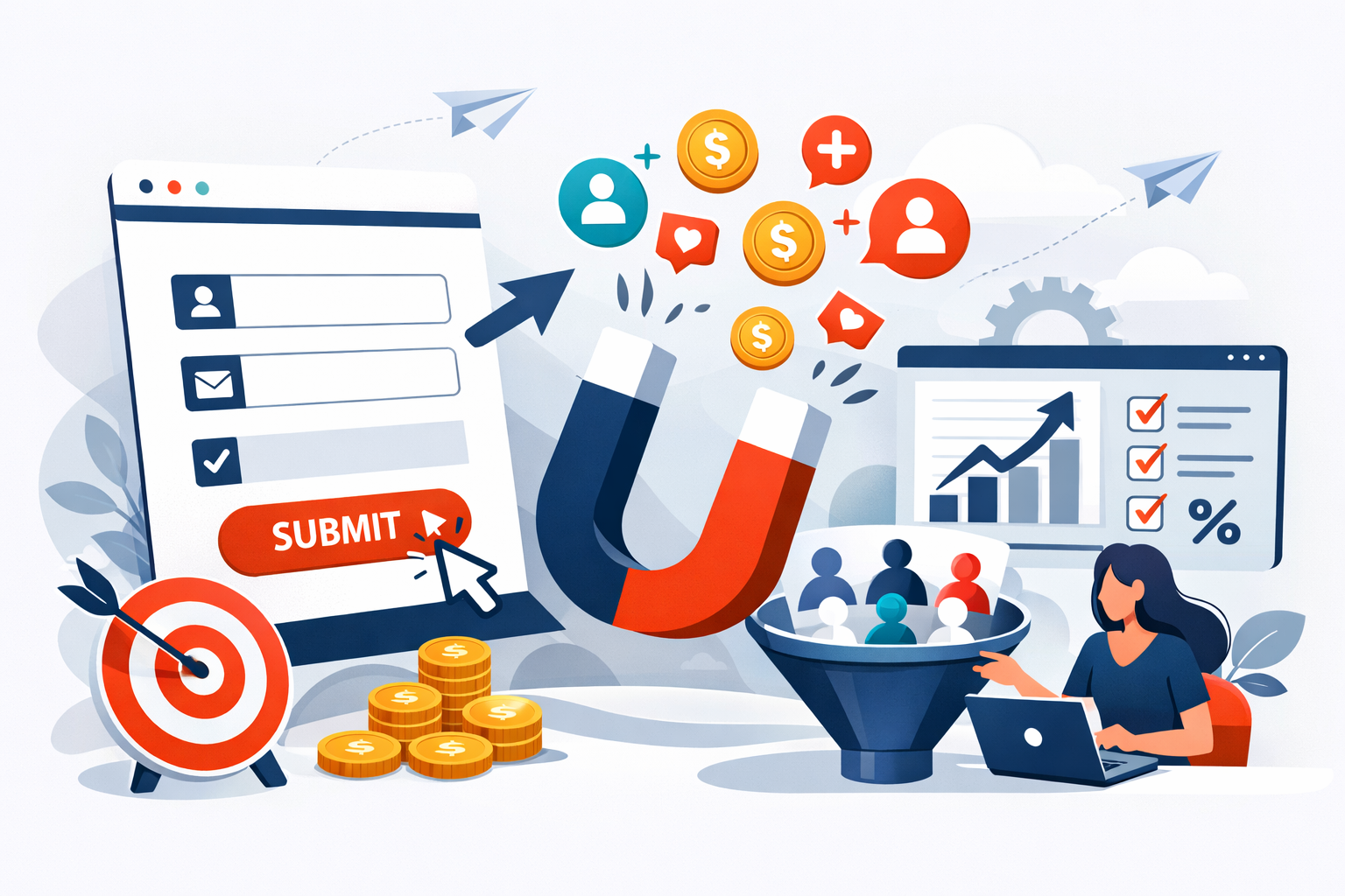
A visitor lands on your website, scrolls through your content, and hovers over your lead capture form. In the next three seconds, they’ll decide whether to share their information or bounce forever. That moment represents thousands of dollars in potential revenue, and most businesses are losing it because of avoidable mistakes in their form design.
I’ve watched companies obsess over ad spend and traffic generation while completely ignoring the conversion bottleneck sitting right on their landing pages. The math is brutal: a form converting at 3% versus one converting at 6% means you’re paying twice as much for every lead. No amount of traffic will fix a broken form.
The good news? Small changes to your lead capture forms often produce dramatic results. I’ve seen businesses double their conversion rates by removing a single field or rewording their button text. These aren’t theoretical improvements from marketing textbooks. They’re tested, measured gains that directly impact your cost per acquisition.
What separates high-converting forms from the ones visitors abandon? It comes down to understanding friction, respecting user psychology, and implementing technical details that most marketers overlook. The practices outlined here will help you capture more leads without increasing your ad budget by a single dollar.
Contents
The Psychology of Friction and User Experience
Every form field represents a micro-decision for your visitor. Should they share this information? Is it worth the effort? What will happen with their data? These questions flash through their minds in milliseconds, and each one creates friction that pushes them toward the back button.
The relationship between effort and perceived value determines whether someone completes your form. When visitors feel the reward justifies the work, they’ll fill out longer forms without complaint. But when the value proposition is unclear or the form feels invasive, even two fields can feel like too many.
Reducing Cognitive Load with Minimalist Design
Cognitive load refers to the mental processing power required to complete a task. Forms with cluttered layouts, confusing labels, or unnecessary visual elements drain this limited resource. By the time visitors reach your submit button, they’re mentally exhausted and more likely to abandon.
Effective form design eliminates everything that doesn’t serve a direct purpose. This means using clear, single-column layouts instead of multi-column configurations that force eyes to jump around. It means writing field labels in plain language rather than internal jargon your visitors won’t understand.
White space matters more than most marketers realize. Cramped forms feel overwhelming even when they contain few fields. Give each input room to breathe, and the entire experience feels lighter and more approachable.
The Impact of Field Count on Conversion Rates
The data on this point is consistent across industries: fewer fields mean higher conversion rates. Research from Unbounce and HubSpot shows that reducing form fields from four to three can increase conversions by up to 50%. Every additional field you add creates exponential friction.
But here’s the nuance most guides miss: the right number of fields depends entirely on what you’re offering. A free ebook download shouldn’t require more than name and email. A consultation request with a senior advisor might justify asking for company size, budget, and timeline.
I recommend this framework: ask only for information you’ll actually use within 48 hours of receiving the lead. If you’re not going to call the phone number immediately, don’t ask for it. If company size won’t change how you handle the lead, skip it. Every field needs to earn its place.
Optimizing Form Layout and Placement
Where your form lives on the page matters as much as what’s in it. The best-designed form in the world won’t convert if visitors never see it or encounter it at the wrong moment in their journey.
Above the Fold vs. Strategic Exit-Intent Popups
The above-the-fold placement remains the default recommendation for lead capture forms, and for good reason. Visitors who see your form immediately don’t need to scroll or search. The conversion path is obvious from the moment they land.
However, exit-intent popups have earned their place in the conversion toolkit when used thoughtfully. These forms appear when a visitor’s cursor moves toward the browser’s close button, catching them at the moment of abandonment. I’ve seen exit-intent forms recover 10-15% of otherwise lost visitors when the offer is compelling enough.
The key is avoiding aggressive popup behavior that annoys visitors before they’ve engaged with your content. Triggering a popup within seconds of page load destroys trust and increases bounce rates. Wait until visitors have scrolled at least 50% of the page or shown clear exit intent before interrupting their experience.
Multi-Step Forms and the Progress Bar Effect
Multi-step forms break longer questionnaires into digestible chunks, using progress indicators to show visitors how close they are to completion. This approach leverages two psychological principles: the commitment escalation effect and the desire for completion.
Once someone completes the first step, they’ve invested effort they don’t want to waste. The progress bar showing “Step 2 of 3” creates a finish line that pulls them forward. Tools like Typeform and Leadpages have built entire businesses around this concept.
Multi-step forms work particularly well for B2B lead capture where you genuinely need more information. Starting with low-friction questions like name and email, then progressively asking for company details and budget ranges, maintains momentum while gathering qualified data. The conversion rate often exceeds single-page forms requesting the same information.
Crafting Compelling Copy and Calls to Action
Form copy is the most underrated conversion factor I encounter. Companies spend thousands on landing page design while using generic headlines and button text that could apply to any business in any industry.
Writing Value-Oriented Headlines
Your form headline should answer one question: what does the visitor get? Not what they have to do, not what you want from them, but what they receive in exchange for their information.
Compare these two headlines:
- “Subscribe to Our Newsletter”
- “Get Weekly Marketing Insights That Actually Work”
The first tells visitors what to do. The second tells them what they’ll gain. This distinction sounds simple, but I estimate 80% of forms I audit use the first approach.
Specificity amplifies value perception. “Download Our Free Guide” is weaker than “Download the 47-Point SEO Checklist We Use for Enterprise Clients.” Numbers, concrete benefits, and exclusivity all strengthen your headline’s pull.
Button Microcopy that Drives Clicks
The submit button is the final conversion barrier, and “Submit” is the worst possible word you can put on it. It sounds like work. It implies obligation. It triggers form anxiety.
Effective button copy reinforces the value exchange and reduces perceived risk. “Get My Free Guide” outperforms “Download Now” which outperforms “Submit.” The possessive “my” creates ownership before the click even happens.
I’ve tested button copy extensively, and first-person phrasing consistently wins. “Start My Free Trial” beats “Start Your Free Trial.” “Send Me the Checklist” beats “Get the Checklist.” The psychological difference is subtle but measurable.
Technical Best Practices for Seamless Submission
Technical implementation can sabotage even the best-designed forms. Slow load times, broken validation, and mobile incompatibility create friction that visitors feel but can’t articulate. They just know something feels wrong and leave.
Mobile Responsiveness and Touch-Friendly Inputs
Mobile traffic now exceeds desktop for most websites, yet I still encounter forms with tiny tap targets and keyboards that don’t match input types. These basic oversights cost conversions every single day.
Touch-friendly design requires input fields at least 44 pixels tall with adequate spacing between elements. Nothing frustrates mobile users more than accidentally tapping the wrong field because everything is crammed together.
Input type attributes matter for mobile experience. Email fields should trigger the email keyboard with the @ symbol readily accessible. Phone fields should display the numeric keypad. These small details reduce friction and errors while showing visitors you’ve thought about their experience.
Inline Validation and Error Handling
Nothing kills form momentum like hitting submit and seeing a page full of red error messages. Inline validation solves this by checking each field as visitors complete it, catching mistakes before they accumulate.
Effective error messages are specific and helpful. “Invalid email” tells visitors nothing useful. “Please include an @ symbol in your email address” tells them exactly how to fix the problem. The tone should guide, not scold.
Real-time validation also provides positive feedback. A green checkmark appearing after a correctly formatted email reassures visitors they’re on track. These micro-interactions build confidence and momentum toward completion.
Building Trust and Compliance
Privacy concerns have never been higher. Visitors want to know who’s getting their data, what you’ll do with it, and how to make it stop. Addressing these concerns directly increases conversion rates while keeping you compliant with regulations.
Leveraging Social Proof and Trust Signals
Trust indicators near your form reduce the perceived risk of submission. Customer logos, testimonial snippets, and security badges all signal that sharing information with you is safe and worthwhile.
The placement of these elements matters. Trust badges directly below your form fields perform better than those buried in the footer. Customer counts like “Join 10,000+ marketers” work particularly well when positioned near the submit button.
Specificity strengthens social proof. “Trusted by marketing teams” is weak. “Used by marketing teams at Salesforce, HubSpot, and Shopify” is powerful. Real names, real companies, and real results build credibility that generic claims cannot match.
GDPR Compliance and Data Privacy Transparency
GDPR and similar regulations require explicit consent for data collection, but compliance shouldn’t feel like a legal obstacle. Transparent privacy practices actually improve conversion rates by addressing visitor concerns head-on.
A brief, clear privacy statement near your form reassures visitors without overwhelming them. “We’ll never share your email. Unsubscribe anytime.” covers the essentials in eight words. Link to your full privacy policy for visitors who want details, but don’t force everyone to read it.
Checkbox consent for marketing communications is required in many jurisdictions. Make the language clear and the checkbox unchecked by default. Visitors who actively opt in become higher-quality leads than those who missed a pre-checked box.
Measuring Success Through A/B Testing
Every recommendation in this article should be tested against your specific audience. What works for one industry or offer might fail for another. A/B testing transforms opinions into data and hunches into proven strategies.
Start with high-impact elements: headlines, button copy, and field count. These changes are easy to implement and often produce the largest conversion lifts. Test one variable at a time so you know exactly what caused any improvement.
Statistical significance matters more than early results. A test showing 20% improvement after 50 visitors means nothing. Wait until you have at least 100 conversions per variation before drawing conclusions. Tools like Google Optimize, Optimizely, and VWO handle the math automatically.
Document everything you test and learn. Over time, you’ll build an institutional knowledge base of what works for your audience. This compounds into a significant competitive advantage as your forms continuously improve while competitors guess.
The difference between mediocre and exceptional lead capture often comes down to dozens of small optimizations rather than one dramatic change. Each percentage point improvement in conversion rate drops your effective cost per lead and increases the return on every marketing dollar you spend.
If you’re looking to take your B2B lead generation beyond form optimization, working with specialists who understand the full acquisition funnel can accelerate results dramatically. Learn more about how Abstrakt Marketing Group helps businesses across North America generate high-quality leads that actually convert to revenue.

Jeff Winters
Jeff Winters is the Chief Revenue Officer (CRO) of Abstrakt and former CEO of Sapper Consulting, acquired by Abstrakt in 2021. A seasoned entrepreneur, Jeff founded Sapper in 2013 and led it to a successful acquisition. With expertise in sales and revenue growth, he drives strategies that deliver results. As co-host of The Grow Show, Jeff shares practical insights and real stories from experienced leaders to help entrepreneurs grow. Tune in weekly on Spotify, Apple Podcasts, and more!